
Floral Color Theory: Choosing Petals that Paint the Mood
When it comes to wedding florals, color does more than decorate—it communicates. It sets the tone, evokes emotion, and tells a story before a single word is spoken. Whether you’re envisioning something bold and expressive or quiet and ethereal, the colors you choose for your flowers will shape the atmosphere of your day in powerful, often subconscious ways.
At its heart, floral color theory is about intention. It’s about moving beyond trends to ask: What do we want this day to feel like?
Why Color Matters in Floral Design
Color is one of the most immediate and visceral elements of design. It influences how we feel, how we interact with a space, and even how we remember a moment.
IN FLORAL DESIGN, COLOR CAN:
Establish a mood (romantic, celebratory, serene, dramatic)
Highlight specific parts of your ceremony or reception
Help tie your floral design into your venue or season
Guide your guests’ experience of the day
Whether you’re working with a full, layered floral palette or leaning into a minimalist monochrome scheme, every hue you choose carries emotional weight and symbolic meaning. From the softness of a barely-there blush to the boldness of saturated jewel tones, color has the power to shift the entire mood of your celebration.
When those choices are made with care… not just for aesthetics but for how they make you feel… your floral design transforms from something decorative into something deeply expressive. That’s where the magic lives: in using color as a language to tell your story, petal by petal.


The Emotional Language of Color
Muted Neutrals: Softness & Romance
Blush, champagne, dusty rose, taupe, and pale sage tones evoke a sense of gentle romance and quiet elegance. These colors are ideal for intimate weddings, garden settings, and couples who want their celebration to feel timeless and serene.
Example mood: a windswept ceremony on a hillside, silk ribbons fluttering in the breeze, and an air of softness that wraps guests like a whisper.

Bold & Saturated: Energy & Emotion
Think rich burgundy, coral, mustard, deep indigo, and magenta. These hues bring drama, passion, and vibrance to your design. They can help anchor a large space or create contrast against minimalist styling. Perfect for couples who want to make a strong visual statement and energize the atmosphere.
Example mood: a joyful summer celebration under string lights, where every petal feels like a firework.
Monochromatic Palettes: Elegance & Focus
Choosing a single color and building a range of tones within it—like pale lavender to deep plum—creates a cohesive, elevated look. Monochrome palettes feel modern and editorial while still being rooted in nature. They allow texture and form to shine, especially when styling bud vases, minimal arrangements, or sculptural installations.
Example mood: a chic city rooftop wedding, clean lines softened by waves of one color that evolves with the light.
Earth Tones: Warmth & Grounding
Rust, ochre, terracotta, olive, and mocha speak to a love of the outdoors and a sense of connection to place. These palettes are especially stunning in fall but work year-round when paired with the right textures. Earth tones bring depth, dimension, and an organic richness that never feels overdone.
Example mood: a barefoot ceremony in the desert or forest, anchored by blooms that mirror the surrounding landscape.

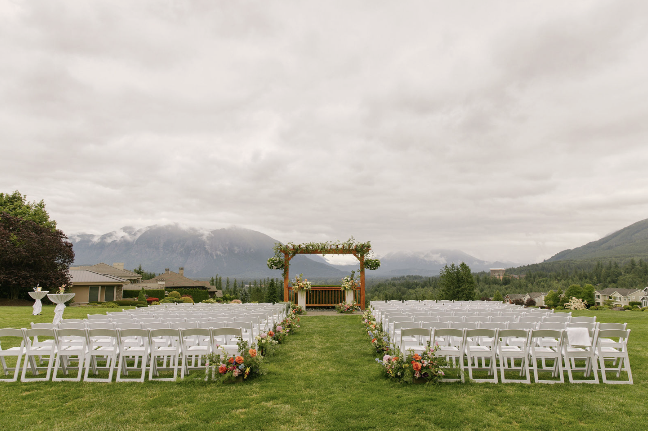
The Same Venue, Transformed
One of the most exciting aspects of floral color theory is its transformative power. Take the same ceremony arch, same layout, same time of day and change only the floral palette.
THE RESULT? A COMPLETELY DIFFERENT FEEL:
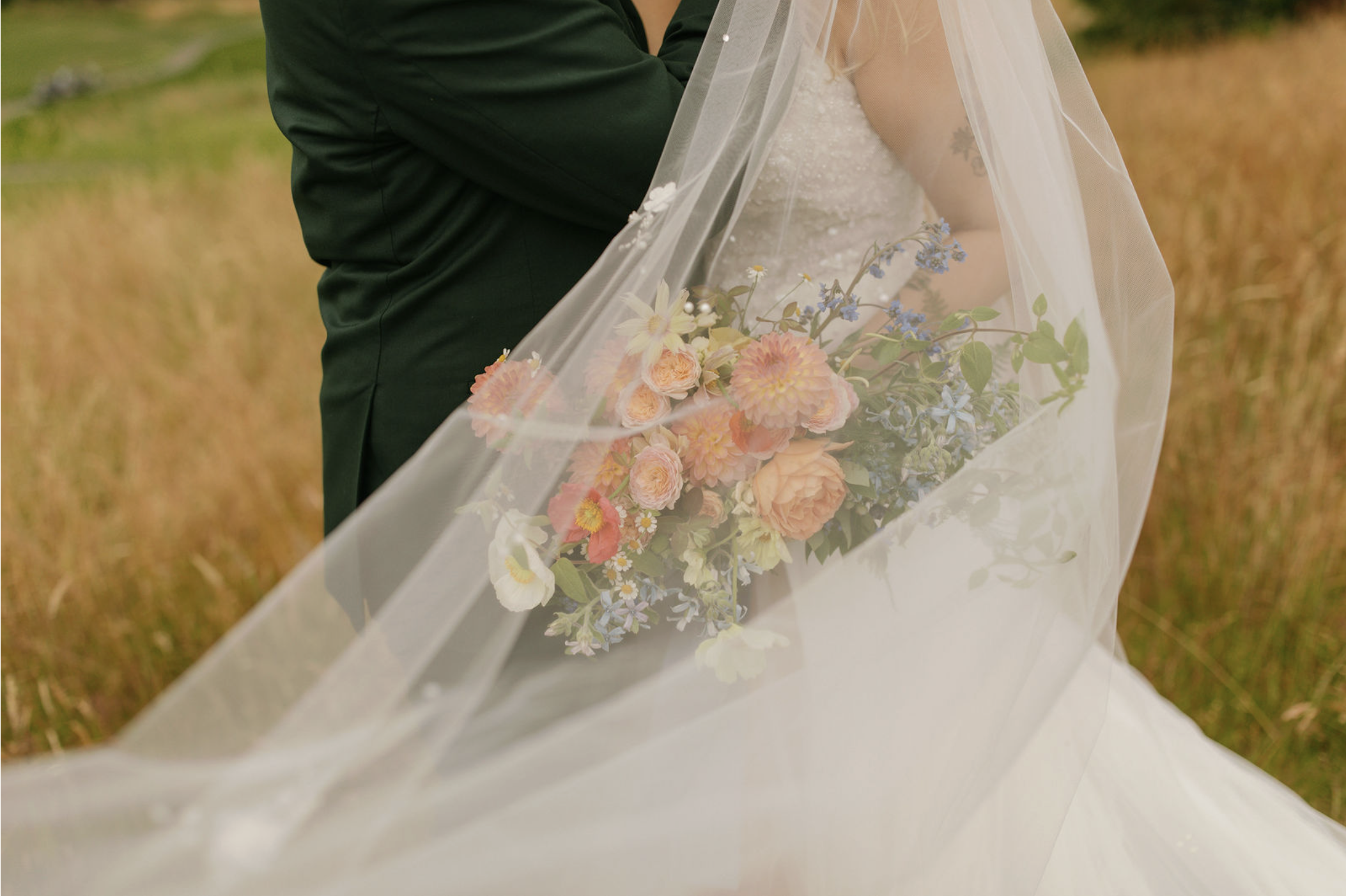
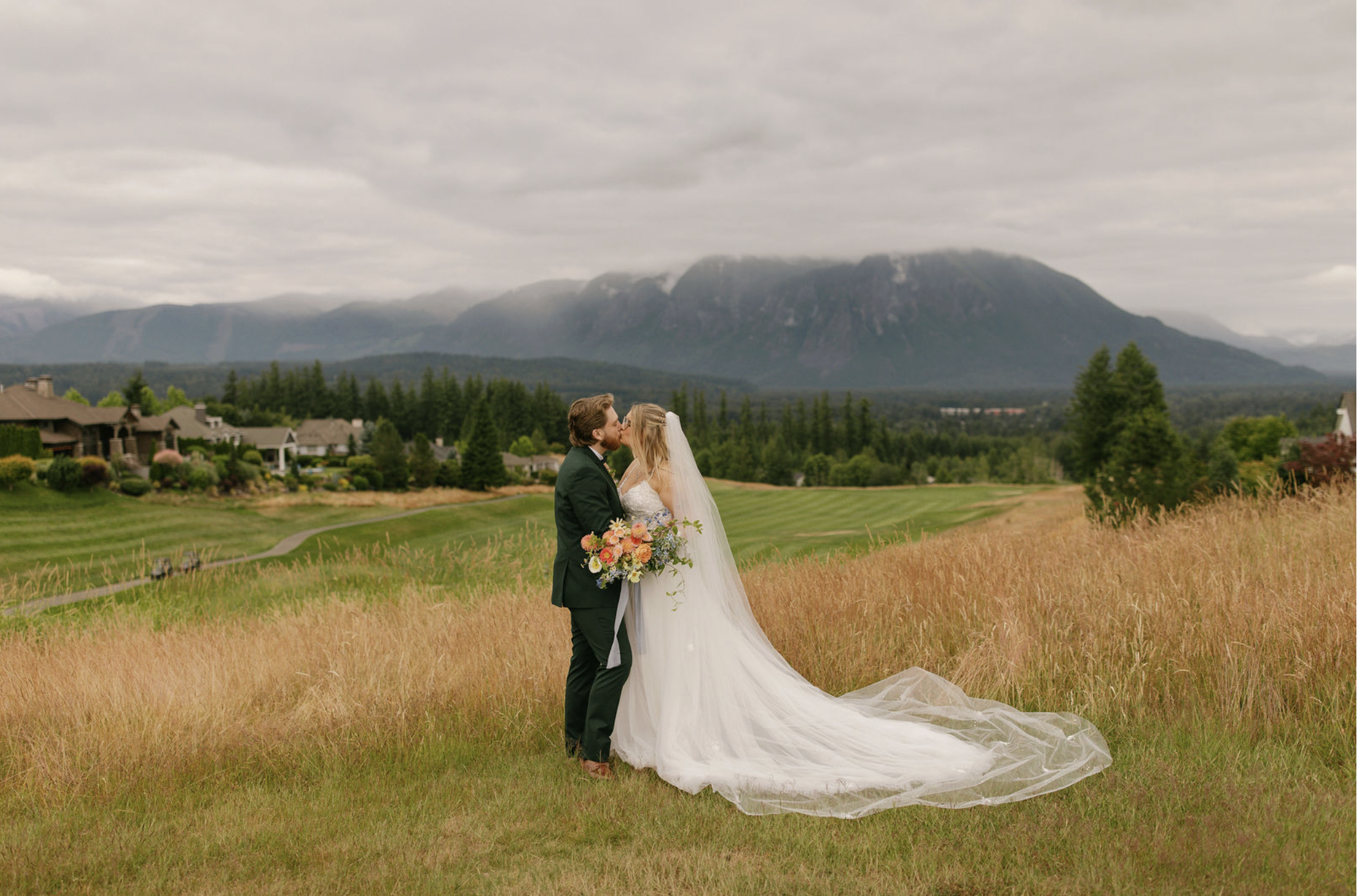
Peach, blush, and white = soft, romantic, airy
Jewel tones with deep greenery = lush, moody, dramatic
Neutral whites and tans with sculptural greens = clean, modern, refined
Sunset-inspired tones (rust, rose, coral, butter yellow) = joyful, warm, expansive
Color doesn’t just enhance your wedding design. It defines it. It sets the emotional tone from the moment guests arrive, shaping how the day feels in ways that words often can’t. The soft whisper of pastels can create an air of romance and tenderness, while deep, saturated tones bring richness and drama to a space.
Even neutral or monochromatic palettes speak volumes. It evokes clarity, cohesion, and intentional calm. When chosen with purpose, your floral color palette becomes more than a visual element. It becomes the emotional undercurrent of your celebration.


Choosing the Right Palette for You
IF YOU ARE UNSURE WHERE TO BEGIN,
TRY ASKING YOURSELF THESE QUESTIONS:
What emotions do we want our wedding to evoke?
Are we drawn to certain seasons or natural landscapes?
What colors are present in our home, our wardrobe, or our favorite memories?
Do we want contrast, softness, cohesion, or a little of each?
Your answers can guide not just your flowers, but your overall aesthetic.
And remember: you don’t need to choose every single color upfront. Often, anchoring your design around one or two core hues and allowing your florist to build a palette from there leads to the most effortless results.

Set the Tone, Shape the Feeling
Floral color theory isn’t about following rules.
It’s about designing with purpose. When you choose colors that feel like you, the entire day becomes more grounded, more expressive, and more memorable.
Because at the end of the day, your flowers are more than just petals. They’re brushstrokes on the canvas of your celebration.
INTERESTED IN BOOKING WITH MOONFLOWER DESIGN?